

Фирменный стиль для инжиниринговой компании «AWARENESS»
Задачи от заказчика:
- создать логотип с плавными начертаниями без острых и грубых элементов;
- что бы фирменный стиль был запоминающимся и передавал название и цель компании;
- использовать простые цвета.
Corporate identity for the engineering company «AWARENESS»
Tasks from the customer:
- create a logo with smooth outlines without sharp or rough elements;
- so that the corporate style is memorable and conveys the name and purpose of the company;
- use simple colors.
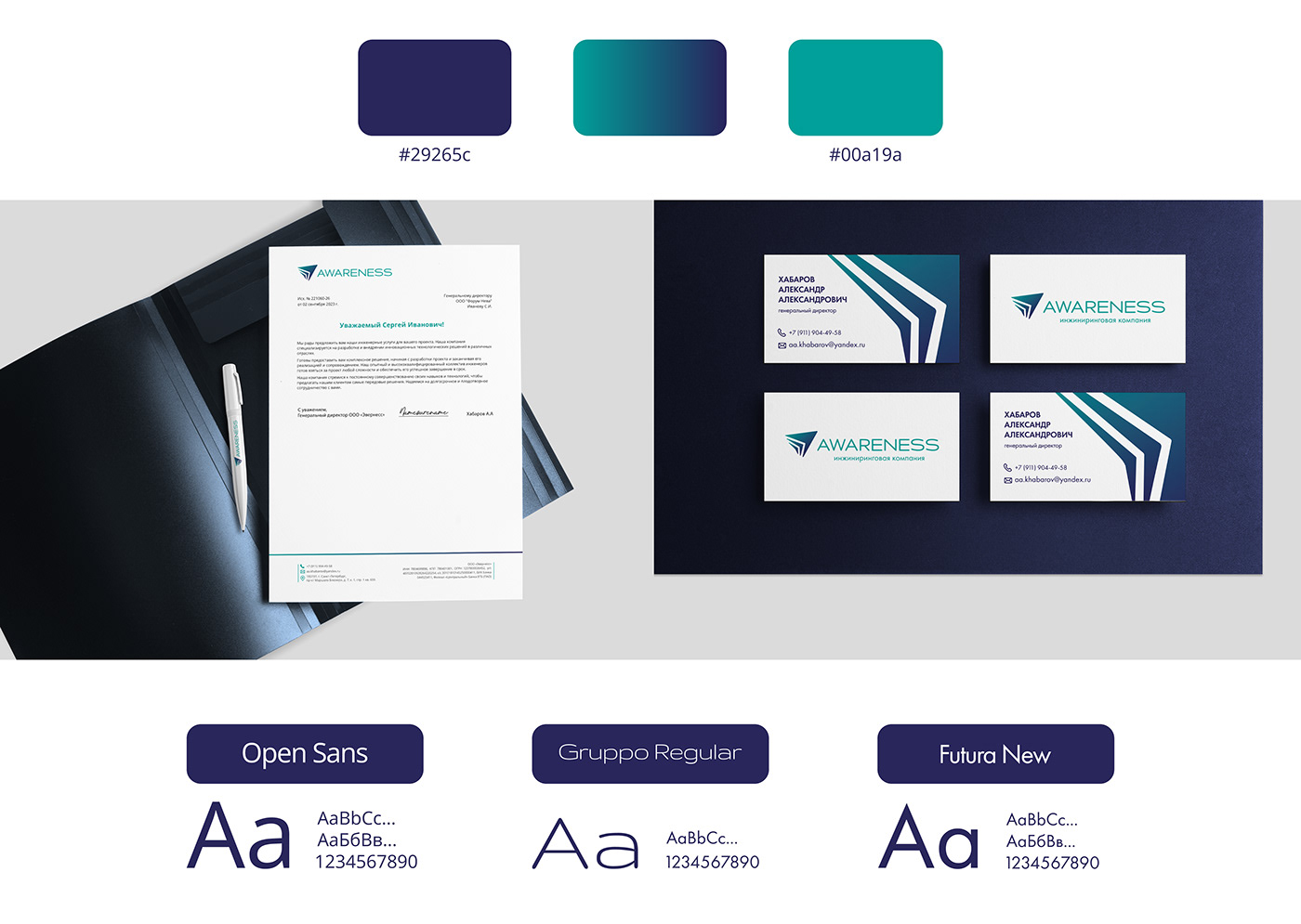
Компания называется «Awareness». Идеология наименования: осознанность, осведомленность. Поэтому фирменный знак должен был показать то, что мы ощущаем, но не можем представить. Чтобы передать «осознанность» было решено изобразить наконечник стрелы с силуэтом буквы А, с мягкими и округленными гранями. Фирменный знак изображен под углом, как стремление к цели, которая скоро достигнет своей точки.
Шрифт был выбран мягкий и одновременно стильный, отлично подходящий
к фирменному знаку.
к фирменному знаку.
Сompany is called “Awareness”. Ideology of the name: awareness, awareness.
Therefore, the brand name had to show what we feel but cannot imagine. To convey “awareness,” it was decided to depict the arrowhead with the silhouette of the letter A, with soft and rounded edges. The brand name is depicted at an angle, as a desire for a goal that will soon reach its point.
The font chosen was soft and at the same time stylish, perfectly suitable
to the brand name.
to the brand name.


